Introduction to Data Visualization in Data Science: Tools and Techniques
In today’s rapidly evolving, data-centric environment, the capability to derive valuable insights from large datasets is essential for informed decision-making. Here's an eye-opening fact: data visualization can improve decision-making by up to 28%. This is why data visualization has become an essential part of the data science process.
Data visualization is the creative process of converting raw data into visual formats like charts, graphs, and maps. This approach allows data scientists to identify trends, patterns, and anomalies, making it easier to understand complex information. In this article, we will examine the different tools and techniques used for data visualization in the field of data science. Whether you're pursuing a data science course, looking for data science training, or working towards a data science certification, understanding these concepts will be invaluable.
The Importance of Data Visualization in Data Science
Data visualization plays a crucial role in data science, serving as a connection between intricate data analyses and the clear communication of insights. Here’s a concise exploration of its importance:
Enhancing Data Understanding
Large datasets can be overwhelming, making it challenging to identify patterns. Data visualization simplifies this by offering intuitive visual summaries, such as bar charts, line graphs, and heat maps, making complex data easier to interpret. This process aids data scientists and business professionals in drawing quicker, more accurate conclusions, underscoring the necessity of visualization skills in data science.
Facilitating Data Storytelling
Data visualization does more than just display facts; it tells stories. Effective data storytelling uses visuals to guide the audience through narratives, emphasizing significant points and trends. Marketers and healthcare professionals often use visualizations to convey complex information, bridging the gap between data and decision-making.
Supporting Decision-Making
Visualized data empowers decision-makers by providing clear insights for informed choices. Executives and managers rely on visual reports to understand performance metrics and predict outcomes. Dashboards in business intelligence tools offer real-time visualizations, enabling organizations to respond swiftly to market changes and seize opportunities.
Incorporating data visualization into data science training is essential for developing the skills needed to leverage these tools effectively in both business and research contexts.
Refer these articles:
- Data Science vs Business Intelligence
- Data Science Challenges and How to Overcome Them
- The Power of Data Science in Business
Key Concepts in Data Visualization
Data visualization is an impactful method for conveying information in a clear and effective manner using visual graphics. Here are some key concepts to understand when working with data visualization:
Types of Data Visualizations
There are several types of visualizations, each serving a different purpose. Some common types include:
- Bar Charts: Perfect for analyzing and contrasting various groups or categories.
- Line Graphs: Great for showing how things change over time.
- Pie Charts: Useful for displaying proportions.
- Heat Maps: Excellent for showing intensity or density of data.
- Scatter Plots: Excellent for uncovering connections among variables.
Choosing the right type of visualization is crucial for presenting your data clearly and meaningfully.
Principles of Effective Visualization
Effective visualizations share several key principles:
- Clarity: The data should be easily interpretable at a glance.
- Accuracy: Your visualization should faithfully represent the underlying data without misleading the audience.
- Simplicity: Eliminate extraneous elements and keep designs simple and straightforward.
- Aesthetics: A well-designed visual appeals to the viewer and keeps them engaged without sacrificing clarity.
Choosing the Right Visualization
Selecting the appropriate visualization depends on the type of data you have and the message you wish to convey. For instance, use a scatter plot if you're examining the relationship between two continuous variables, or a heat map to represent data concentration in different geographic regions. Understanding the strengths of each type of visualization is a key skill emphasized in many data science training programs.
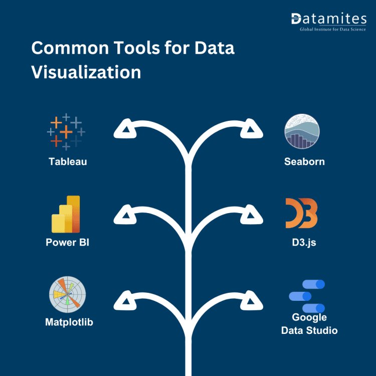
Common Tools for Data Visualization
Data visualization plays a vital role in deciphering intricate data sets and conveying insights clearly. Here are some common tools used for data visualization:
Tableau
Overview and Features: Tableau is a widely-used data visualization tool known for its ability to handle large datasets and create interactive dashboards. It offers an intuitive drag-and-drop interface, ensuring ease of use for both novice and experienced users alike.
Use Cases:
- Business intelligence dashboards.
- Financial data analysis.
- Healthcare analytics.
Power BI
Overview and Features: Microsoft's Power BI is another leading tool for data visualization, offering integration with various data sources like Excel and SQL databases. It provides robust reporting features and real-time data updates.
Use Cases:
- Sales performance tracking.
- Operational efficiency monitoring.
- Financial reporting.
Matplotlib and Seaborn (Python Libraries)
Overview and Features: For Python enthusiasts, Matplotlib and Seaborn are powerful libraries for creating a wide variety of plots and visualizations. Matplotlib is more basic but versatile, while Seaborn offers higher-level features for aesthetically pleasing and statistically insightful graphics.
Use Cases:
- Exploratory data analysis in data science projects.
- Academic research.
- Statistical data visualization.
D3.js
Overview and Features: D3.js is a JavaScript library for creating dynamic, interactive data visualizations in the web browser. It allows for significant customization, which makes it a favorite among developers and designers.
Use Cases:
- Interactive dashboards.
- Data-driven animations.
- Custom web-based reports.
Google Data Studio
Overview and Features: Google's free tool, Data Studio, enables users to craft personalized dashboards by utilizing data from various sources, including Google Analytics and Google Sheets. It’s an excellent option for smaller businesses or teams on a budget.
Use Cases:
- Marketing reports.
- Website traffic analysis.
- Social media performance tracking.
Read these articles:
- Top Data Science Certifications to Boost Your Career
- What is Certified Data Scientist Course
- Data Science Career Scope in India
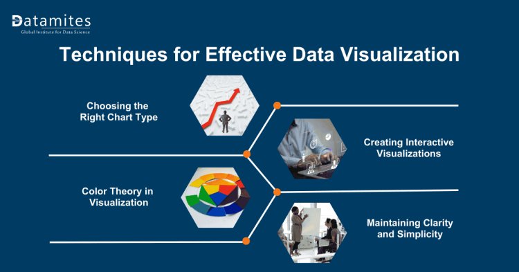
Techniques for Effective Data Visualization
Enhancing your data visualization skills is important for effectively sharing insights from data. Here are some key techniques and best practices to help you enhance your abilities:
Choosing the Right Chart Type
Choosing the right type of chart is crucial for clearly conveying your message.
- Bar Charts: Ideal for comparisons across categories.
- Line Charts: Ideal for monitoring changes as they occur over time.
- Pie Charts: Utilize it sparingly to illustrate the ratios within a whole.
Understanding when to use each type will improve your visualization's clarity and informativeness, making it easier for your audience to understand.
Color Theory in Visualization
Color plays a significant role in how viewers perceive your data:
- Use color to highlight key insights.
- Use fewer colors to keep the viewer from feeling overwhelmed.
- Use contrasting colors to differentiate between categories.
When utilized properly, color enhances understanding and transforms your visualizations into more engaging experiences.
Creating Interactive Visualizations
Interactive visualizations allow users to explore data on their own, adding a dynamic element to your reports:
- Benefits: They improve data interaction and allow for a deeper analysis of trends.
- Tools: Tableau, Power BI, and D3.js all offer features for building engaging and interactive dashboards.
Maintaining Clarity and Simplicity
Data visualization aims to make complex data easier to understand and accessible to everyone. To achieve this, avoid unnecessary clutter:
- Reduce the number of data points presented to prevent overwhelming your audience.
- Use whitespace to give your visualization breathing room, improving clarity.
Best Practices for Data Visualization
Data visualization is essential for data analysis because it helps turn complicated datasets into easy-to-understand formats. Here are some key tips to remember when creating effective data visualizations:
Know Your Audience
- Tailoring your visualizations to your audience ensures they can easily grasp and gain value from your data.
- Use simpler visuals for non-technical audiences.
- Dive into complex visuals only when presenting to data experts.
Highlight Key Insights
- Focus on the most important data points:
- Use color or size to emphasize important insights.
- Avoid sharing extra details that could distract from your main message.
Consistent Design
A consistent design improves user experience:
- Use the same font consistently and stick to a unified color palette.
- Maintain uniform layouts for dashboards or reports.
Iterative Testing and Feedback
Data visualization is often an iterative process:
- Seek feedback from colleagues to improve clarity.
- Refine your visuals based on real-world use.
Read these articles:
Practical Uses of Data Visualization in the Field of Data Science
Data visualization plays a vital role in data science by enabling the interpretation of intricate data sets and facilitating the effective communication of insights. Here are several real-world applications of data visualization across different domains:
Business Intelligence
In industries like finance, marketing, and healthcare, data visualization plays a crucial role in business intelligence.
- Examples: Visualizing sales performance, customer segmentation, and financial forecasting.
- Benefits: Faster decision-making, improved operational efficiency.
Academic Research
Researchers utilize data visualization techniques to effectively communicate their findings, whether dealing with intricate statistical models or extensive datasets.
- Examples: Visualizing scientific data, social behavior studies, and environmental research.
- Benefits: Clearer interpretation of complex data, enhanced peer collaboration.
Public Policy
Data visualization is a vital tool for public policy analysts, enabling transparent communication of data-driven decisions to the public.
- Examples: Visualizing population trends, economic forecasts, and healthcare outcomes.
- Benefits: Informed decision-making, public trust through transparency.
Data visualization plays an integral role in simplifying complex data and supporting decision-making in data science. Whether you're taking a data science course, engaged in data science training, or earning a data science certification, mastering data visualization tools and techniques is essential. Utilize these tools to turn your data into meaningful insights that drive action.
At DataMites Institute, we are dedicated to equipping individuals with the essential skills needed for data-driven decision-making. Our Data Science Offline Course offers a comprehensive learning experience that combines theoretical foundations with hands-on projects, ensuring you gain real-world expertise. Accredited by IABAC and NASSCOM FutureSkills, our programs cover critical areas such as artificial intelligence, machine learning, and big data, taught by experienced instructors. With flexible learning options, we cater to both beginners and professionals eager to advance their careers in data analytics. Join us to discover and harness your potential in the ever-changing world of technology!