Box Plot in Data Science: How to Visualize Data Spread
A box plot visually summarizes data spread, highlighting median, quartiles, and outliers, making it easy to compare distributions and detect patterns in datasets.

In Data Science, understanding the behavior of data is critical for making informed decisions. One of the most effective ways to gain insights into your data is through data visualization. Among the variety of visualization techniques, the Box Plot in Data Science stands out as a powerful tool to analyze data spread and detect irregularities quickly.
A box plot, also called a whisker plot, is a statistical graphic that summarizes a dataset using five key values: minimum, first quartile, median, third quartile, and maximum. Additionally, it highlights outliers in data, which are unusual values that deviate significantly from the rest of the dataset.
By visualizing data distribution using box plots, beginners and professionals alike can quickly understand the central tendencies, variability, and potential anomalies in the dataset. Whether analyzing student test scores, financial performance, or customer behavior, box plots provide a clear snapshot that makes exploratory data analysis (EDA) simple and actionable.
Understanding Box Plots
A box plot provides a concise summary of a dataset using a visual format that’s easy to interpret. Let’s break down its components:
- Median(Q2): The median is the middle value of the dataset when arranged in ascending order. It represents the dataset’s center.
- Example: Test scores of 55, 60, 65, 70, 75 → Median = 65
- Quartiles (Q1 and Q3): Quartiles divide the data into four equal parts:
- Q1 (first quartile) is the median of the lower half of the data.
- Q3 (third quartile) is the median of the upper half.
- Quartiles show how data points are spread across the dataset and help identify clusters.
- Interquartile Range (IQR): IQR = Q3 – Q1. It measures the range of the middle 50% of data and helps detect outliers in data.
- Whiskers: Whiskers extend from the box to the smallest and largest values within 1.5×IQR from Q1 and Q3. Values beyond this range are considered outliers.
- Outliers: Outliers are extreme points in a dataset. Detecting them is crucial in data analysis, as they may indicate errors, anomalies, or special cases.
Visual Example:
Imagine a box plot where the middle box covers most sales values of a retail store, with whiskers extending to the minimum and maximum sales. Any unusually high or low sales points outside the whiskers are flagged as outliers.
By understanding these components, beginners can quickly interpret data spread, symmetry, and extremes, making Data Science visualization more effective.
Importance of Box Plots in Data Science
Box plots are vital in Data Science visualization tools for several reasons:
- Detect Outliers: Quickly identify unusual data points that may skew analysis or indicate anomalies.
- Understand Data Distribution: Visualize the median, quartiles, and interquartile range (IQR) to see patterns, symmetry, or skewness.
- Compare Multiple Datasets: Easily compare groups, time periods, or categories side by side, such as sales across regions or student performance across classes.
- Support Decision-Making: Aid in real-world applications like finance (detect unusual stock trends), healthcare (identify abnormal patient readings), and marketing (spot irregular customer behavior).
- Simplify Complex Data: Condenses large datasets into a clear visual format, making insights easier to grasp and act upon.
By providing a quick visual summary, box plots make exploratory data analysis (EDA) more intuitive, enabling professionals to focus on insights rather than raw numbers.
Refer these articles:
- What Is Correlation in Data Science?
- A Beginner’s Guide to Bagging in Data Science
- Top Databases Every Data Scientist Should Know in 2025
Creating a Box Plot: Step-by-Step Example
Let’s create a box plot using a simple example dataset.
Dataset: Monthly sales (in $) of a retail store:
3000, 2500, 4200, 2700, 3200, 4800, 3500, 4000, 4500, 3600
Step 1: Arrange the Data
Arrange it in ascending order: 2500, 2700, 3000, 3200, 3500, 3600, 4000, 4200, 4500, 4800
Step 2: Find the Median (Q2)
Middle values: 3500 and 3600 → Median = 3550
Step 3: Calculate Quartiles
- Q1 (lower half median) = 3200
- Q3 (upper half median) = 4200
Step 4: Compute IQR
IQR = Q3 – Q1 = 4200 – 3200 = 1000
Step 5: Determine Whiskers and Outliers
- Lower bound = Q1 – 1.5×IQR = 3200 – 1500 = 1700
- Upper bound = Q3 + 1.5×IQR = 4200 + 1500 = 5700
No sales fall outside this range → No outliers
Step 6: Draw the Box Plot
Box from Q1 (3200) to Q3 (4200)
Median at 3550
Whiskers to minimum (2500) and maximum (4800)
Interpretation: Most sales are between $3200–$4200, with no extreme outliers. Managers can quickly understand performance trends.
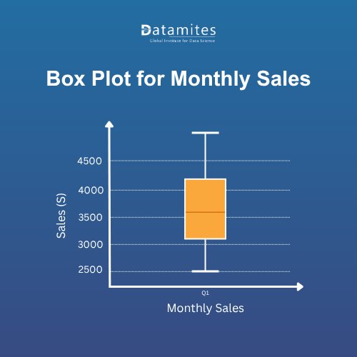
Here’s the box plot for the monthly sales dataset you provided.
- The box spans from Q1 (3200) to Q3 (4200).
- The median is at 3550.
- Whiskers extend to the minimum (2500) and maximum (4800).
- No outliers are present in this dataset.
This visual clearly shows the data spread and helps identify the central tendency and variability at a glance.
Applications of Box Plot in Real-World Data Science
Box plots are not just classroom tools; they are widely used across industries to analyze and interpret data efficiently. Here are some real-world examples:
- Finance: In the finance industry, analysts use box plots to study stock price volatility. Wide boxes indicate high variability, while outliers reveal sudden spikes or crashes, helping finance professionals make informed investment decisions.
- Healthcare: In the healthcare sector, box plots are used to compare patient recovery times or treatment effectiveness. A smaller box with fewer outliers indicates more consistent recovery outcomes, guiding healthcare providers in selecting reliable treatments.
- Education: In education, educators use box plots to analyze exam score distributions. Narrow spreads show uniform performance, while wide ranges with outliers highlight varying student capabilities, informing educational interventions.
- Retail & Marketing: In the retail and marketing industry, box plots reveal customer spending patterns. Identifying high-value outliers enables marketing teams to design targeted campaigns or premium loyalty programs.
- Manufacturing: In manufacturing, box plots are used in quality control to monitor production consistency. Outliers in defect rates or production times help manufacturing managers identify issues and improve overall product quality.
By highlighting outliers, trends, and data distribution, box plots provide actionable insights across industries from finance and healthcare to education, retail, and manufacturing.
Refer these articles:
- Your Roadmap to Becoming a Data Science Architect
- The Role of Data Science in Protecting Cultural Heritage
- How to Deploy Your First Data Science Project on the Cloud
Creating Box Plots Using Popular Tools
Box plots can be easily created using popular tools, whether you prefer coding or visual software:
- Python (Matplotlib & Seaborn): Use simple code to plot data and visualize outliers. Ideal for analysis of large datasets.
- Excel: Insert a Box & Whisker chart directly from your data. Great for beginners and quick visualizations.
- Tableau: Drag numeric and categorical fields, then select Box-and-Whisker Plot. Perfect for interactive dashboards.
- Power BI: Use the Box and Whisker visual for business data, with filtering and real-time insights.
- R (ggplot2): Create highly customizable box plots for statistical analysis.
Focus on understanding the concept and interpretation rather than coding it’s more important to interpret box plots correctly than just create them.
A Box Plot in Data Science is more than just a visual tool it summarizes data spread, highlights outliers, and makes analysis clear and actionable. By simplifying complex datasets, it allows professionals to spot trends and anomalies quickly.
Mastering box plots strengthens Data Science visualization skills, enabling faster exploratory analysis and helping turn raw data into meaningful insights that guide smarter decisions.
With the growing demand for data science, learning practical techniques like bagging through professional data science courses can open the door to numerous career opportunities in data science. According to Research and Markets, the data science platform market is expected to grow from $120.49 billion in 2024 to $154.79 billion in 2025, at a 28.5% CAGR. As the field evolves rapidly, gaining hands-on knowledge of ensemble methods today will help you stay ahead of emerging trends.
Now is the ideal time to begin your data science journey. Enrolling in data science training in Coimbatore, Pune, Hyderabad, Ahmedabad, Bangalore, Chennai, or Mumbai equips you with practical skills, live project experience, and expert career guidance. With increasing demand for skilled professionals, the right data science training can open doors to diverse and rewarding career opportunities in data science across industries.
Among the top institutes, DataMites Institute stands out for its industry-focused curriculum and emphasis on experiential learning. Through live projects and internship programs, DataMites ensures learners gain real-world exposure while bridging the gap between theoretical knowledge and practical application.
DataMites Certified Data Scientist courses, accredited by IABAC and NASSCOM FutureSkills, cover essential tools, machine learning workflows, and advanced analytics skills highly sought after in sectors such as finance and beyond. For classroom learning, DataMites offers data science courses in Coimbatore, Pune, Chennai, Mumbai, Bangalore, Hyderabad, Ahmedabad, and Kolkata. For greater flexibility, their online programs deliver the same high-quality education to learners worldwide, making it easier than ever to pursue a career in data science.