Exploratory Data Analysis

What is Exploratory Data Analysis?
Exploratory Data Analysis (EDA) is an approach used by data scientists to analyze datasets and summarize their main characteristics, with the help of data visualization methods. It helps data scientists to discover patterns, and economic trends, test a hypothesis or check assumptions.
Why is Exploratory Data Analysis (EDA) Important in Data Science?
The main purpose of EDA is to help look at data before making any assumptions. It can help identify the trends, patterns, and relationships within the data. Data scientists can use exploratory analysis to ensure the results they produce are valid and applicable to any desired business outcomes and goals. Once EDA is complete and insights are drawn, its features can then be used for data analysis or modeling, including machine learning.
Exploratory Data Analysis
Types of Analysis
- Univariate Analysis
‘Uni’ means ‘One’, as the name suggests, Univariate analysis is the analysis which is performed on a single variable. The variables can be both categorical variables or numerical variables.
- Bivariate Analysis
Bivariate Analysis is the analysis which is performed on 2 variables. The variables can be both categorical variables and numerical variables or 1 categorical variable and 1 numerical variable.
- Multivariate Analysis
Multivariate analysis is the analysis which is performed on multiple variables.
Refer this article to know: Support Vector Machine Algorithm (SVM) – Understanding Kernel Trick
What is Exploratory Data Analysis
How Exploratory data analysis is performed?
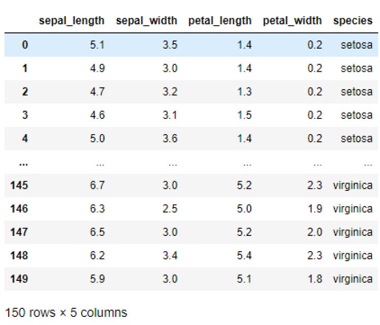
Let’s see an example of how Exploratory Data Analysis is performed on the iris dataset.
Importing the required libraries
import matplotlib.pyplot as plt
import seaborn as sns
import pandas as pd
import numpy as np
Loading the dataset
df= sns.load_dataset(“iris”)
Output:
Read this article to know: Python Tuples and When to Use them Over Lists
Getting the shape of the dataset using shape
df.shape
Output:

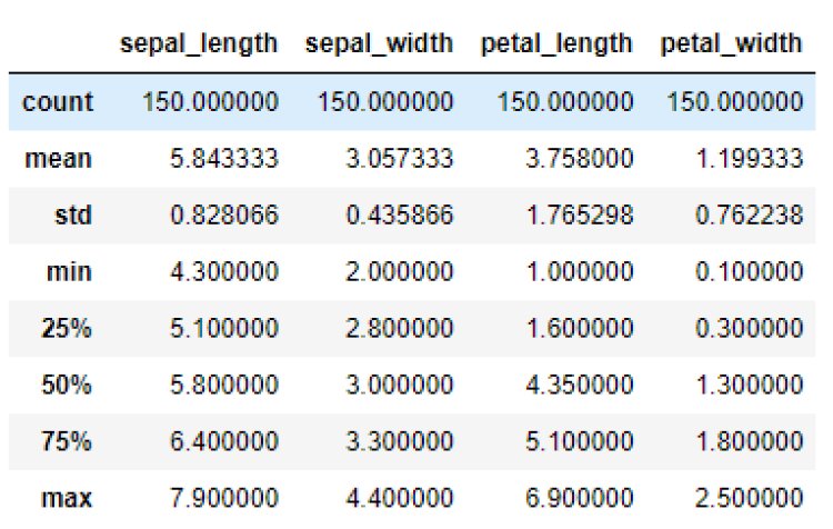
This means that the dataset contains 150 rows and 5 columns.
Let’s get the summary of the dataset using describe() method
The describe() function performs the statistical computations on the dataset like count of the data points, mean, standard deviation, extreme values etc.
df.describe()
Output:
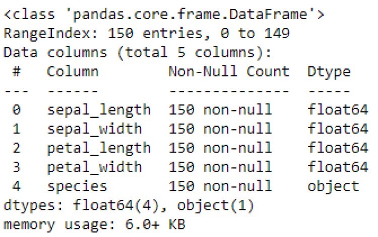
Now let’s get the columns and datatypes using info()
df.info()
Output:
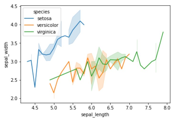
- Line Plot
sns.lineplot(x=’sepal_length’,y=’sepal_width’,data=df,hue=’species’)
plt.show()
Output:
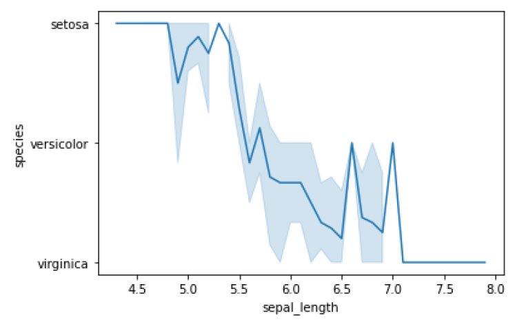
sns.lineplot(x=’sepal_length’, y=’species’, data=df)
plt.show()
Output:
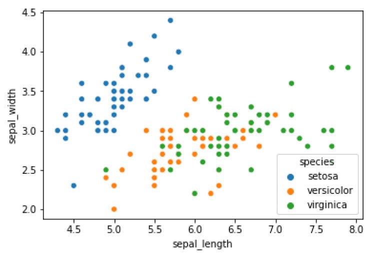
- Scatter Pot
sns.scatterplot(x=’sepal_length’,y=’sepal_width’,data=df,hue=’species’)
plt.show()
Output:
Also refer this article: A Complete Guide to Stochastic Gradient Descent (SGD)
Insights:
- Virginica species has the highest and setosa species has the lowest sepal width and sepal length.
- Setosa has a sepal width between 2.3 to 4.5 and a sepal length between 4.5 to 6.
- Versicolor has a sepal width between 2 to 3.5 and a sepal length between 5 to 7.
- Virginica has a sepal width between 2.5 to 4 and sepal length between 5.5 to 8
- Bar Plot
It shows the relationship between the categorical variables and the numerical variables.
sns.barplot(x=’species’,y=’petal_length’, data=df)
plt.show()
Output:
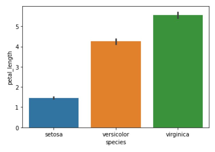
Insights:
- The petal length of virginica is 5 and above.
- The petal length of setosa is between 1 and 2.
- The petal length of versicolor is between 4 and 5.
- Count Plot
sns.countplot(x=’species’, data=df)
plt.show()
Output:
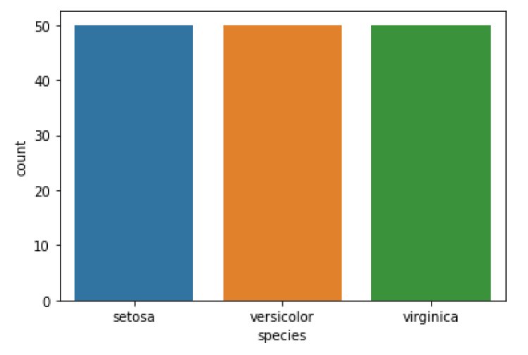
Insights:
The number of records for each species is 50.
- CatPlot
sns.catplot(x=’petal_length’,y=’species’,data=df)
plt.show()
Output:
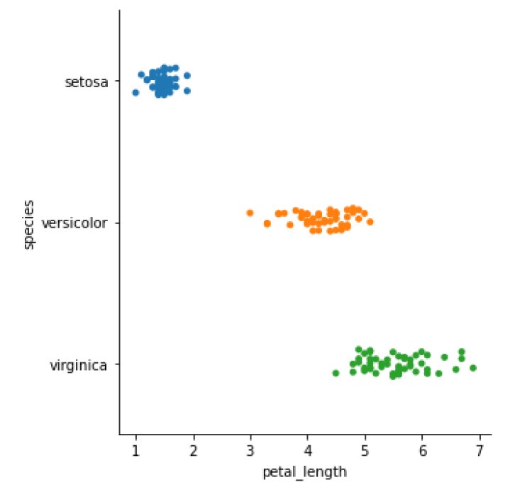
Insights:
- Setosa has petal lengths between 1 and 2.
- Versicolor has a petal length between 3 and 5.
- Virginica has petal lengths between 5 and 7.
Violin Plot
sns.violinplot(x=’species’, y=’sepal_width’, data=df)
plt.show()
Output:
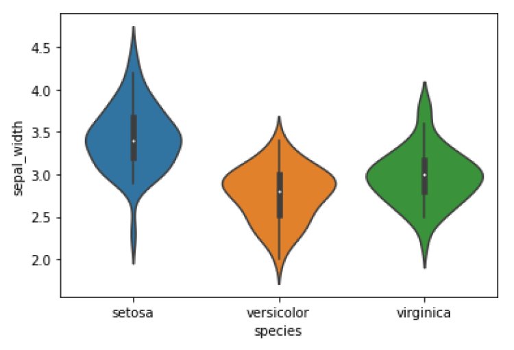
Insights:
50% of data points in setosa lie within 3.2 and 3.6.
50% of data points in versicolor lie within 2.5 to 3.
50% of data points in Virginia lie within 2.6 to 3.4
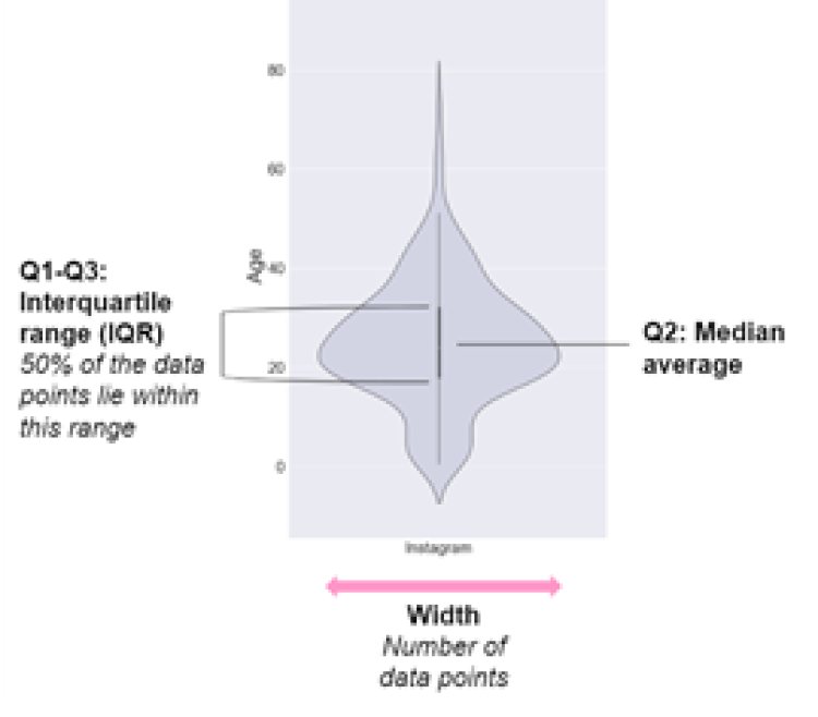
Points to be remembered before writing insights for a violin plot
- Strip Plot
sns.stripplot(x=’species’, y=’petal_width’, data=df)
plt.show()
Output:
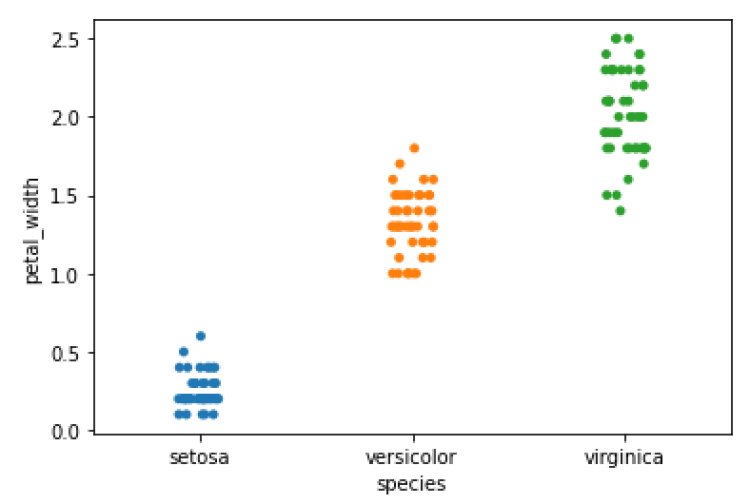
Insights:
- Setosa has a petal width between 0.1 and 0.6.
- Versicolor has a petal width between 1 and 2.
- Virginica has a petal width between 1.5 and 2.5.
- Histogram
sns.histplot(x=’petal_width’, data=df)
plt.show()
Output:
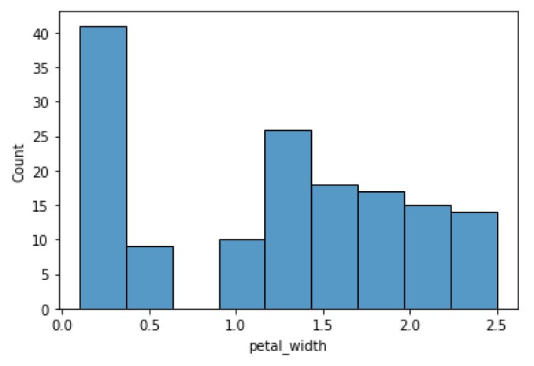
Insights:
The petal width between 0.1 and 0.4 has the maximum data points – 40.
The petal width between 0.4 and 0.5 has a minimum data point – 10.
- Distplot
sns.distplot(df[‘petal_width’],hist=True,color=”r”)
plt.show()
Output:
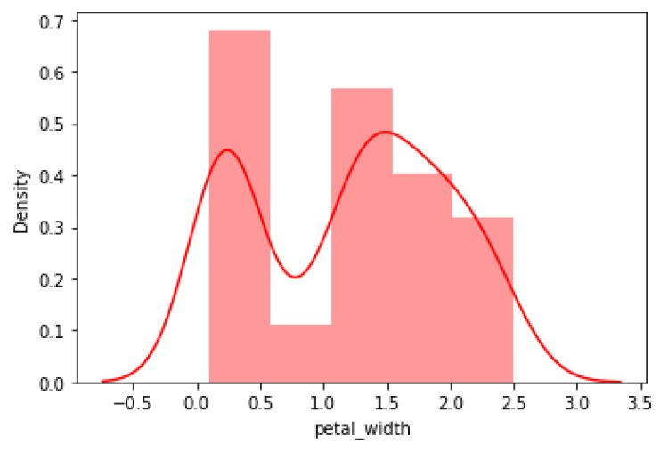
Insights:
From the above plot, we can say that the data points are not normally distributed.
- Heat Map
tc = df.corr()
sns.heatmap(tc,annot=True)
plt.show()
Output:
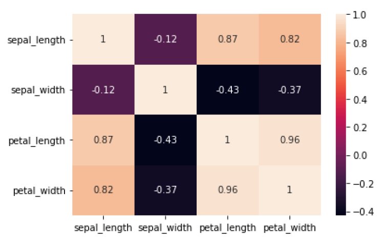
A heat map is used to find the correlation between 2 input variables. The threshold value for correlation is 0.9.
Insights:
From the above plot, no variables are correlated.
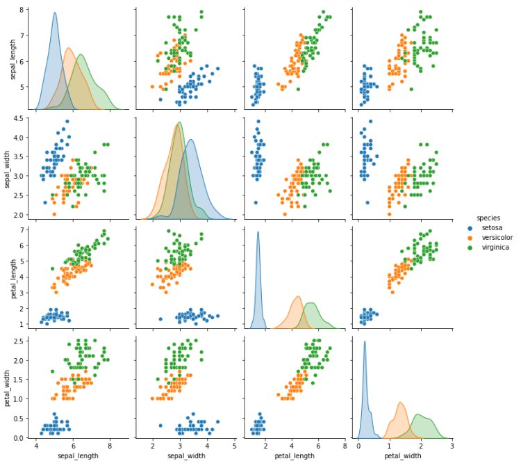
- Pair Plot
sns.pairplot(data=df,hue=’species’)
plt.show()
Output:
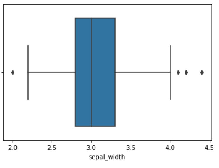
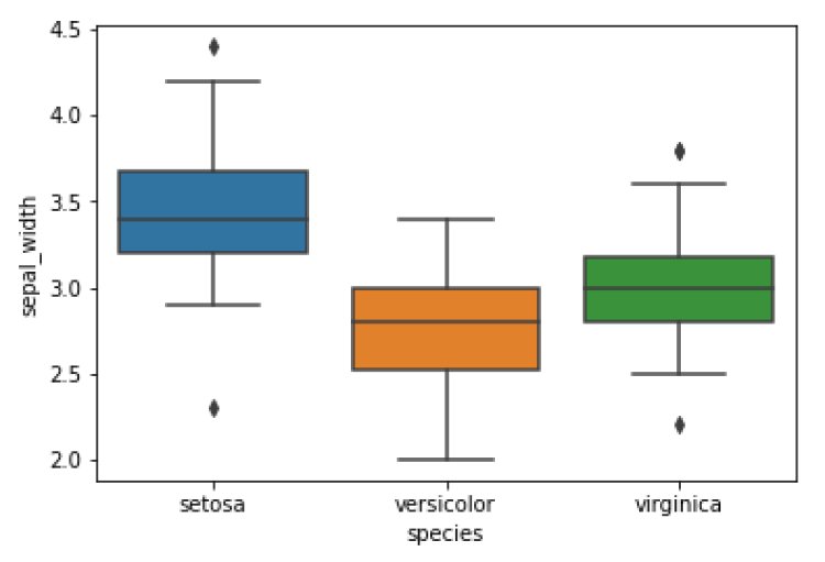
Handling Outlier
An outlier is an extremely high or extremely low data point that is noticeably different from the rest. Outlier is found with the help of a box plot.
Box Plot
A Box plot is used to find the outliers present in the data.
sns.boxplot(x=’sepal_width’,data=df)
plt.show()
Output:
sns.boxplot(x=’species’, y=’sepal_width’, data=df)
plt.show()
Output:
Simple Exploratory Data Analysis with Pandas

Advantages and Disadvantages of Exploratory Data Analysis:
Advantages:
- By Extracting averages, mean, minimum and maximum values it improves the understanding of the variables.
- Discover the outliers, missing values and errors made by the data.
- Identifying the patterns by visualizing data using box plots, scatter plots and histograms.
Disadvantages:
Exploratory research comes with disadvantages that include offering inconclusive results, lack of standardized analysis, small sample population and outdated information that can adversely affect the authenticity of the information.
Being a prominent data science institute, DataMites provides specialized training in topics including ,artificial intelligence, deep learning, Python course, the internet of things. Our machine learning course at DataMites have been authorized by the International Association for Business Analytics Certification (IABAC), a body with a strong reputation and high appreciation in the analytics field.
Data Visualization using AutoViz