Tools for Visualizing Machine Learning Models
Explore the best tools for visualizing machine learning models, understand data patterns, and gain actionable insights to enhance your AI and ML projects effectively.
Machine learning (ML) has transformed industries by enabling systems to learn from data and make intelligent decisions. However, one of the biggest challenges for practitioners and stakeholders lies in understanding what’s happening inside these models. While accuracy scores, precision, and recall provide quantitative metrics, they rarely explain why a model makes a particular prediction.
This is where visualization tools for machine learning models come in. They bridge the gap between complex algorithms and human understanding, making ML more transparent, interpretable, and trustworthy. In this article, we’ll explore why visualization matters, different categories of visualization tools, popular tools used by ML professionals, visualization strategies for various model types, best practices, and final insights.
Why Visualization Matters in Machine Learning
Visualization is not just about creating pretty charts it’s about enhancing interpretability, debugging, and decision-making. Let’s break down why it matters:
1. Model Transparency
Many machine learning models, especially deep learning ones, function as “black boxes.” Visualization techniques help open these boxes by showing feature importance, decision boundaries, and neuron activations.
2. Debugging and Error Analysis
Visualization reveals where models fail. For instance, confusion matrices and ROC curves highlight misclassifications, while feature contribution plots expose biases.
3. Stakeholder Communication
Business leaders and non-technical teams often find statistical terminology difficult to understand. Visualization tools offer clear, intuitive graphics that simplify conversations and foster better collaboration. With the rise of AI, around 37% of business leaders are prioritizing employee upskilling over the next two to three years.
4. Ethics and Fairness
Model bias is a growing concern in AI. Visualization tools help uncover hidden biases across demographics, ensuring fairer outcomes.
5. Model Optimization
By analyzing how models behave during training such as learning curves and loss graphs data scientists can fine-tune parameters more effectively.
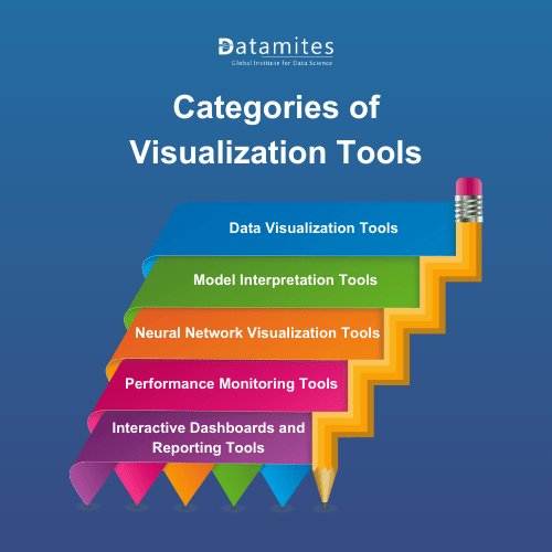
Categories of Visualization Tools
Visualization tools for machine learning can be classified into different categories based on their purpose and functionality. Understanding these categories will help you select the right tool for your project.
1. Data Visualization Tools
Before training a model, practitioners use tools like Matplotlib, Seaborn, and Plotly to analyze data distribution, correlations, and outliers. These tools ensure cleaner and better-prepared data.
2. Model Interpretation Tools
These tools explain how machine learning models function internally. They include frameworks like LIME (Local Interpretable Model-agnostic Explanations) and SHAP (SHapley Additive exPlanations) that highlight feature contributions to predictions.
3. Neural Network Visualization Tools
Deep learning models require specialized visualization due to their complexity. Tools like TensorBoard and Netron allow practitioners to view network architectures, layer activations, and training progress in real-time.
4. Performance Monitoring Tools
These tools track metrics such as precision, recall, accuracy, and ROC curves to evaluate how well the model performs in different scenarios. MLflow and Weights & Biases fall under this category.
5. Interactive Dashboards and Reporting Tools
Dashboards created using tools like Power BI, Tableau, or custom-built with Plotly Dash enable interactive exploration of model outputs, making them ideal for business stakeholders.
Refer these below articles:
- Understanding Kernel Methods in Machine Learning
- Genetic Algorithm in Machine Learning
- What is Transfer Learning in Machine Learning?
Popular Tools for Visualizing ML Models
Several tools dominate the machine learning visualization landscape. Below are some of the most widely used and reliable options, along with practical examples of how they are applied:
1. TensorBoard
A part of TensorFlow, TensorBoard is one of the most popular tools for visualizing neural networks. It provides insights into model architecture, training metrics, histograms, and embeddings.
Example: While training an image classification model on the CIFAR-10 dataset, TensorBoard can display accuracy and loss curves in real-time, allowing data scientists to detect overfitting early.
2. SHAP (SHapley Additive exPlanations)
SHAP is widely recognized for explaining individual predictions by assigning contribution values to each feature. Its plots clearly show the influence of features across datasets.
Example: In a credit risk model, SHAP plots can reveal that a customer’s “income stability” and “payment history” were the most influential factors behind a loan approval decision.
3. LIME (Local Interpretable Model-Agnostic Explanations)
LIME creates local approximations of complex models to explain predictions. It is model-agnostic, making it versatile for linear models, decision trees, and deep networks.
Example: For a sentiment analysis model, LIME can highlight specific words (like “excellent” or “terrible”) that contributed to the classification of a review as positive or negative.
4. Matplotlib and Seaborn
These Python libraries remain foundational for data and result visualization. They provide simple yet powerful plots for analyzing model inputs, outputs, and residuals.
Example: When building a regression model to predict house prices, Seaborn can be used to plot residual distributions, helping to check if the model errors follow a normal distribution.
5. Plotly and Dash
Plotly offers interactive, publication-ready graphs, while Dash enables building interactive web apps for model monitoring and stakeholder presentations.
Example: A customer churn prediction dashboard built with Dash can allow business teams to filter by region or customer segment and instantly see churn probabilities with interactive charts.
6. Netron
A popular tool for visualizing neural network architectures from frameworks like PyTorch, TensorFlow, and Keras. It is highly useful for understanding complex models layer by layer.
Example: When developing a Convolutional Neural Network (CNN) for medical image analysis, Netron can display each convolutional and pooling layer, making the architecture more interpretable.
7. Weights & Biases (W&B)
W&B offers end-to-end experiment tracking and visualization. It integrates with most ML frameworks and provides collaborative dashboards for teams.
Example: A data science team building a fraud detection system can use W&B to compare multiple model versions, visualize precision-recall curves, and share results with stakeholders in real time.
8. MLflow
MLflow is often used for experiment management, but it also offers visualization capabilities, especially for tracking model metrics across runs.
Example: While testing different hyperparameter settings for a random forest classifier, MLflow can track accuracy and F1-score for each run, helping select the best-performing configuration.
According to Statista, the artificial intelligence market is projected to reach US$73.98 billion in 2025. It is further expected to grow at a compound annual growth rate (CAGR) of 26.95% between 2025 and 2031, resulting in a market volume of approximately US$309.70 billion by 2031.
Visualization in Different Types of Models
1. Linear and Logistic Regression Models
For these models, visualizations focus on feature weights, residual plots, and decision boundaries. Simple tools like Matplotlib or Seaborn are often sufficient.
2. Decision Trees and Random Forests
Tree-based models can be visualized using tools like Graphviz and Yellowbrick. These visualizations reveal how decision splits occur at each node, offering high interpretability.
3. Support Vector Machines (SVMs)
Visualization focuses on decision boundaries, margin widths, and support vectors. Tools like Scikit-learn’s plotting utilities are commonly used here.
4. Clustering Algorithms
For algorithms like K-Means or DBSCAN, visualization involves scatter plots, silhouette plots, and dimensionality reduction techniques like PCA and t-SNE. Tools like Plotly and Matplotlib are effective.
5. Deep Learning Models
Neural networks require advanced visualization of training progress, loss curves, activation maps, and feature embeddings. TensorBoard and Netron are the go-to tools here.
6. Ensemble Models
For models like Gradient Boosting or XGBoost, feature importance charts and SHAP values provide meaningful explanations of model decisions.
Read these below articles:
Best Practices in Model Visualization
To maximize the value of machine learning visualization tools, it’s important to follow best practices that ensure clarity, accuracy, and relevance. Visualization should not only help data scientists understand their models but also make results accessible to business leaders, stakeholders, and end users. Below are the key principles to keep in mind:
1. Keep it Simple and Clear
The primary goal of visualization is to communicate insights effectively. Avoid cluttered graphs, confusing legends, or unnecessary details that overwhelm the audience. For instance, a simple bar chart showing feature importance can often be more impactful than a highly complex, multi-layered plot. Clear and concise visuals ensure stakeholders stay engaged and understand the story behind the data.
2. Use Multiple Visualization Approaches
Relying on a single chart rarely gives the complete picture. To gain deeper insights, combine different types of visualizations such as:
- Feature Importance Plots – Show which variables influence predictions the most.
- Residual Plots – Highlight model errors and areas for improvement.
- Learning Curves – Display how performance changes with training size, helping detect overfitting or underfitting.
By presenting results from multiple angles, you create a more comprehensive and trustworthy understanding of your model.
3. Ensure Reproducibility
Reproducibility is crucial in machine learning workflows. Stakeholders should be able to trace visual results back to specific model runs or datasets. Tools like Weights & Biases (W&B) and MLflow allow seamless integration with ML pipelines, making it possible to reproduce, audit, and compare visualizations across experiments. This practice not only builds trust but also ensures consistency in collaborative projects.
4. Focus on Interpretability, Not Just Accuracy
A model with high accuracy may still lack fairness, transparency, or generalizability. Visualization should go beyond metrics like precision or recall to explain how and why the model is making predictions. For example, using SHAP or LIME plots can reveal whether certain features disproportionately influence outcomes. Prioritizing interpretability builds confidence in your models and ensures ethical AI development.
5. Highlight Business Relevance
Visualizations are most effective when tied directly to real-world outcomes. Instead of just presenting abstract metrics, contextualize results in terms of business impact. For instance, in a customer churn prediction model, showing how churn probability varies by customer demographics or purchase history provides stakeholders with actionable insights. Aligning visuals with business objectives makes machine learning more accessible and valuable.
6. Stay Updated with Tools
The landscape of machine learning visualization tools evolves rapidly. Libraries and frameworks are continuously updated with new features, interactive capabilities, and integration options. Staying current with tools like TensorBoard, SHAP, or Plotly ensures you can leverage the latest advancements in interpretability and usability. Continuous learning also gives you a competitive edge in implementing best-in-class practices.
As artificial intelligence evolves, mastering visualization techniques is becoming essential for fostering trust and transparency in machine learning solutions. In an artificial intelligence course in hyderabad, you can develop expertise in these tools and enhance your ability to design models that are not only accurate but also interpretable, reliable, and ethically sound.
DataMites Artificial Intelligence Course in Pune is accredited by globally recognized bodies like IABAC and NASSCOM FutureSkills, ensuring industry-aligned training and credibility. Along with high-quality instruction, DataMites offers comprehensive support services such as resume building, interview preparation, and dedicated placement assistance, helping learners smoothly transition into rewarding careers in the data and AI domains.