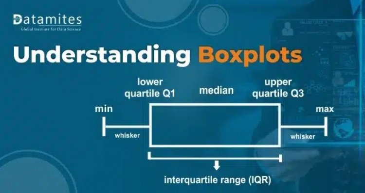
Introduction to Boxplots
Introduction:
Boxplots are generally used in order to measure how well data from a given dataset is distributed. It basically divides the distribution into three parts or we call it three quartiles.
Below is an example of what a box plot looks like:
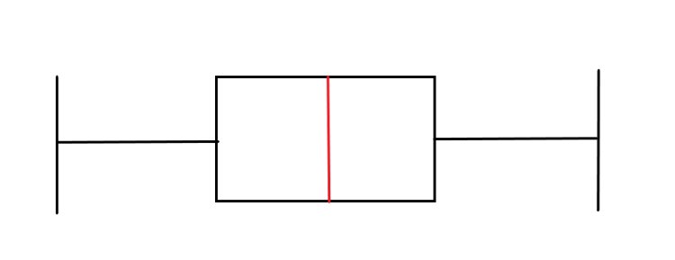
The boxplot is generally divided into different regions:
- Lower limit
- First Quartile
- Middle Quartile
- Third Quartile
- Upper Limit
- In a box plot, the middle quartile contains 50% of the data and is usually represented by a box-like structure. It’s between the first quartile and third quartile where the majority of the data is present. The first and the third quartile comprise 25% of the overall data. The middle quartile is also called the Interquartile Range.
- The two vertical lines at both ends are called the Upper limit and Lower limit of the boxplot.
- The red vertical line in the box structure represents the median of the distribution.
Refer this article: Support Vector Machine Algorithm (SVM) – Understanding Kernel Trick
Significance of Boxplots:
- We use boxplots to see how the data is distributed and what region the majority of the data falls.
- Boxplots are pretty useful as it provides a summary of the data using which we get to identify the mean values and also how much skewness is present in the distribution.
- If the distribution has skewness then the Boxplot structure also is different. The median line gets pushed because of the skewness in the data. This is how we know the data has skewness.
- One of the most important uses of Boxplot is to identify outliers.
Read this article: Python Tuples and When to Use them Over Lists
Outliers with Boxplots:
- Outlets are data points that are not part of the normal distribution of the data. They are usually away from the normal range of the data.
- There are many ways to identify outliers, boxplot is one of the most effective methods to detect the presence of outliers.
- Boxplot internally uses the IQR(Interquartile range) and a simple formula to identify the outliers.
- Any data points that are beyond the upper limit and before the lower limit are classified as outliers.
Let us see what a boxplot with outliers looks like:
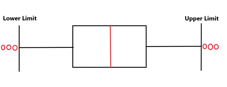
- The red circles are nothing but outliers.
- Generally, we say that the data points that are beyond the upper limit and below the lower limit are usually classified as outliers.
- To identify the outliers first we need the lower and upper limits. As they are not directly represented automatically.
- To get the Upper and Lower limit we use Interquartile Range(IQR) method.
- IQR is the region between the First quartile and the Third Quartile. So we use a simple formula:
Q3-Q1
- The above formula will give us the IQR.
- Now we have IQR, we use two formulas to get the Upper and Lower limits:
Upper limit=Q3+1.5*IQR
Lower Limit=Q1-1.5*IQR
- Now we have upper and lower limits, we just use simple conditions and we can get the outliers.
Also refer this article: 10 Common Data Structures Every Programmer Must Know
Here is a sample python code for a boxplot implementation:
- In python, we have two libraries which have the boxplots.
- Matplotlib
- Seaborn
- For the sample code, we will use boxplots from the seaborn package.
- For the distribution, we will use the random number generator to generate random data from a normal distribution.
import numpy as np
import seaborn as sns
#create a sample dataset
data=np.random.normal(100,20,200)
#creating the boxplot
sns.boxplot(data)
Output:

What is Box Plot

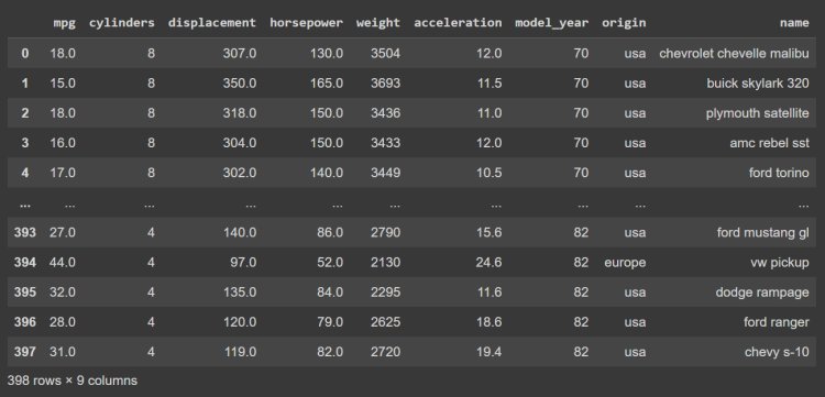
Using datasets from seaborn:-
- We will be using one of the built-in datasets called “mpg” provided with the seaborn package
import matplotlib.pyplot as plt
import seaborn as sns
#importing the dataset from seaborn package
data=sns.load_dataset(‘mpg’)
data
#using boxplot to visualize one of the features
sns.boxplot(data.sepal_length)

Being a prominent data science institute, DataMites provides specialized training in topics including machine learning, deep learning, Python course, the internet of things. Our artificial intelligence at DataMites have been authorized by the International Association for Business Analytics Certification (IABAC), a body with a strong reputation and high appreciation in the analytics field.
What is Objective Function

Data Visualization using AutoViz