How Data Visualization Skills Can Help Data Science Students
Discover how data visualization skills help data science students interpret complex data, identify trends, communicate insights, and make data-driven decisions.
 Prerana B A
Data science students often work with large datasets that are difficult to interpret using tables alone. Data visualization in data science transforms raw data into charts, graphs, and dashboards, helping students explore information and present findings clearly. Developing these skills can support academic projects, strengthen analytical abilities, and prepare students for future opportunities in data science.
Why Are Data Visualization Skills Important for Data Science Students?
Data visualization helps data science students explore datasets and interpret information more effectively. Visual representations make it easier to examine distributions, compare variables, and investigate unusual observations that may require further analysis.
For example, a histogram can show the distribution of examination marks, while a line chart can illustrate changes in sales over time. A scatter plot can help students explore relationships between variables. Selecting the right visualization encourages students to ask better analytical questions and investigate data systematically.
Learning data visualization in data science also helps students communicate their findings to classmates, instructors, and non-technical audiences. However, charts must be designed and interpreted carefully to avoid misleading conclusions. Learning to present data accurately is an important foundation for further study in data science.
Refer to these articles:
- Modern Data Stack for Data Scientists: Tools You Must Know
- Databricks vs Snowflake: Which Is Better for Data Science
- How Data Scientists Can Build AI Agents Using Python
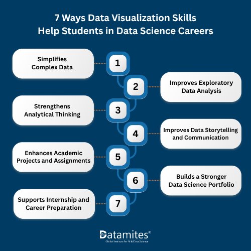
7 Ways Data Visualization Skills Help Students in Data Science Careers
Data visualization helps students interpret complex datasets, develop analytical thinking, and communicate findings effectively. According to Grand View Research, the global data visualization tools market is projected to grow from USD 11.8 billion in 2025 to USD 34.8 billion by 2033. This growth highlights the relevance of visualization skills in modern data analysis.
1. Simplifies Complex Data
Large datasets can be difficult to understand through tables alone. Charts and graphs summarize information, making patterns and comparisons easier to identify.
For example, a bar chart comparing student performance across subjects can quickly reveal differences in average marks and areas that may need further investigation.
2. Improves Exploratory Data Analysis
Exploratory data analysis (EDA) helps students understand datasets before applying statistical methods or machine learning algorithms.
Histograms reveal data distributions, box plots highlight potential outliers, and scatter plots help explore relationships between variables. These visualizations can uncover unusual patterns and guide further analysis.
3. Strengthens Analytical Thinking
Creating effective visualizations requires students to identify relevant variables, choose suitable charts, and interpret the results.
For example, comparing customer spending across age groups can help students investigate purchasing patterns and test assumptions. Combining visualization with statistical methods helps them draw more reliable conclusions.
4. Improves Data Storytelling and Communication
Data storytelling combines data, visual evidence, and a clear explanation to communicate findings.
Instead of presenting several unrelated charts, students can organize their analysis around a specific question, explain the main observations, and describe their limitations.
For example, a project on online sales might show monthly revenue trends, compare product categories, and identify periods that deserve further investigation. This approach makes the report easier to follow and helps the audience understand why the findings matter.
5. Enhances Academic Projects and Assignments
Data visualization helps students present research methods and results clearly in reports, presentations, and classroom assignments. Appropriate charts allow readers to understand comparisons, trends, and key findings without relying entirely on lengthy descriptions.
For example, a student researching rainfall patterns could use a line chart to examine monthly changes and a bar chart to compare annual totals. Selecting visuals that match the research question makes the results easier to interpret.
The aim is to support the research with relevant evidence, not to include charts simply to make a report look more detailed.
6. Builds a Stronger Data Science Portfolio
A portfolio allows students to demonstrate their analytical skills through practical projects. Well-designed visualizations help communicate the problem, analysis, and key findings.
Students can create projects using public datasets on transport, e-commerce, education, or environmental trends. Including data sources, methods, visualizations, and conclusions makes each project more informative and easier to evaluate.
7. Supports Internship and Career Preparation
Data visualization in data science helps students demonstrate their ability to interpret findings and communicate analytical decisions during internship applications and job interviews. Learning to use data science tools such as Python, Tableau, and Power BI can further strengthen their practical skills, particularly in roles involving data analysis, reporting, and presenting insights to stakeholders.
Candidates may be asked to analyze datasets, select appropriate charts, explain observed trends, or discuss the limitations of their conclusions. Practising these tasks helps students justify their visualization choices, interpret results accurately, and recognize when additional evidence is needed.
Essential Data Visualization Skills and Tools for Students
To get started, students should first understand the fundamentals of presenting data clearly and accurately.
- Chart selection: Learn when to use bar charts for comparisons, line charts for trends, histograms for distributions, and scatter plots for relationships between variables.
- Visual design: Use appropriate colors, readable fonts, clear labels, meaningful titles, and consistent scales to make charts easy to interpret.
- Data storytelling: Practice explaining what a visualization reveals, why the findings matter, and what conclusions the data supports.
- Dashboard design: Learn to organize related charts and key metrics into clear, interactive dashboards that help users explore information efficiently.
Several data visualization tools can help students apply these skills:
- Matplotlib: A Python library that provides detailed control over static charts and figure design.
- Seaborn: A Python library for creating statistical graphics and exploring data distributions and relationships.
- Plotly: A tool for building interactive charts with features such as hover information and zooming.
- Tableau: A visual analytics platform for creating interactive dashboards and business reports.
- Microsoft Power BI: A business intelligence tool for visualizing metrics, exploring data, and developing reports.
Choose tools based on your current skills and learning goals. Beginners can start with Python libraries to practise chart creation or use dashboard platforms to develop practical reporting skills. Focus on selecting appropriate visualizations and communicating findings accurately before exploring more advanced features.
How to Develop Data Visualization Skills for Data Science Career
Data visualization is an essential skill for data science students, helping them understand complex datasets, identify patterns, and present findings clearly. By practising with real-world datasets and working on hands-on projects, students can strengthen their analytical skills, communicate data-driven insights effectively, and build a strong foundation for a successful data science career.
Step 1: Learn the fundamentals: Understand common charts, including bar charts, line charts, histograms, scatter plots, and box plots. Learn how to match each chart to a specific analytical question.
Step 2: Practice with real-world datasets: Explore publicly available education, weather, transport, or sales data. Check data types, missing values, and unusual observations before creating visualizations.
Step 3: Choose a visualization tool: If you are learning Python, practise creating charts with Matplotlib and Seaborn. You can also explore Tableau or Power BI to develop dashboarding skills.
Step 4: Build a small project: Start with a focused question, such as how monthly sales vary by product category. Create a few relevant charts that help answer the question rather than displaying every variable.
Step 5: Explain your findings: Summarize the patterns you observe, their possible interpretations, and any limitations. Avoid presenting correlations as proof of causation.
Step 6: Create a portfolio: Showcase selected projects with clear explanations, appropriate source attribution, and reproducible code where possible. This helps others understand your analytical approach.
Step 7: Seek feedback: Ask someone to interpret your charts and identify anything unclear. Refine titles, labels, color contrast, and explanations to make your visualizations easier to understand.
By applying these steps consistently, students can build practical data visualization skills for students and become more confident in presenting analytical findings. These abilities can complement their knowledge of programming, statistics, and machine learning as they prepare for a data science career.
Refer to these articles :
- What Is Correlation in Data Science? Importance, and Real-World Examples
- Your Roadmap to Becoming a Data Science Architect
- What Is Regression Analysis in Data Science? A Beginner’s Guide
Data visualization is a valuable skill for data science students because it helps transform complex data into clear, meaningful insights. By learning data visualization in data science, practicing with real-world datasets, and creating meaningful charts, students can improve their analytical and communication skills, strengthen academic projects, and showcase their abilities to potential employers. These skills also complement their knowledge of programming, statistics, and machine learning, helping them prepare for future opportunities in data science.
Developing data visualization skills is an important step toward building a successful career in data science. For learners looking to gain practical knowledge, data science courses in Delhi offered by DataMites provide training in key areas such as Python programming, statistics, machine learning, and data visualization. With a global community of more than 200,000 learners, DataMites aims to help aspiring data professionals strengthen their technical skills and prepare for opportunities in data science and analytics.
DataMites supports learners in developing practical, industry-relevant skills for careers in the technology sector. With 50+ offline centres across India and learners in 30+ countries, the institute has a presence in cities such as Bangalore, Chennai, Pune, Hyderabad, Coimbatore, Ahmedabad, Mumbai, Kolkata, Gurgaon, and Noida. Learners exploring data science courses in Hyderabad can choose training programs in data science, data analytics, artificial intelligence, machine learning, Python, and deep learning. Through hands-on projects, internship opportunities, and placement assistance, DataMites aims to help aspiring professionals strengthen their technical knowledge and prepare for opportunities in data science and related fields.